This article was updated. Jump to Update 1. Update 2.
I’m not so much a Pokefan, but I saw this little burning pony and the VFX for the mane caught my attention in just a split second:
Just to underline why I think this is a fascinating effect: Often, especially when using classic approaches (and no modern things like e.g. volume ray marching), one has to decide between volume OR silhouette.
Example: The sphere on the left offers a nice volume but boring silhouette. On the other hand, the crossed planes on the right have a complex silhouette, but even with an unlit material (so that light and shadow don’t reveal the secret) the texture itself gives immediately away, that it’s just mapped to planes.
So, how in the holy Poké Ball is it possible, that the mane of our flamy horsy has such a nice silhouette AND the fire texture scrolling on top appears volumetric and doesn’t reveal any crossed planes?
The secret is, that they use both approaches in combination with each other! Here you can see how the mesh is structured. There is a big “volumetric” geometry (right) and “inside” there are crossed planes (left).
Let’s start with the crossed planes. In fact, it’s not just crossed planes. We can see little “tear”-shaped volumes which are surrounded by poly stripes. The UVs of these stripes are carefully crafted so that a very simple texture can run along it.
Here you can see an example how all the UVs look like. Also in this picture, the very small 64x32px texture running along the poly stripes:

And now the magic starts: This whole thing isn’t even visible! It’s just rendered into a so-called stencil buffer (which can be used like a Layer Mask in Photoshop to show only a certain region of a layer). Here you see the resulting stencil buffer in Unreal – like I said, it’s just a black/white mask:
The next magical step: Take the volumetric geometry, apply the fire material (just a simple unlit material with a small scrolling noise texture) and – important – let this material only be visible where the stencil buffer is white. We just cut away all pixels outside the wonderful white area. Voilà!
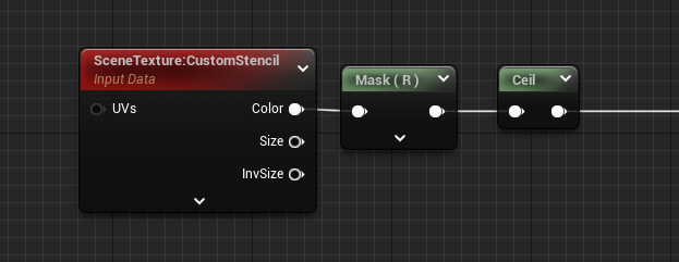
By the way, this is how the stencil buffer can be accessed in Unreal. If you want to know more about the setup of a stencil buffers, check out this video.
And here you can see the original lava mare. The extra wiggle motion is done via bones and not by vertex shader.
Thanks for reading up to here, I hope you liked the article. Let me know in the comments!
Have a super-duper day,
Simon ♥
Several people have asked me about the setup, so I decided to add some more details:
This is the material setup for the part, which writes the silhouette into the stencil buffer. It’s a masked material which does not render into the main pass, but it writes a custom stencil value of 1.

Next is the material which is applied to the volumetric geometry. This reads from the stencil buffer (the ceil pushed the stencil value of 1 to 255 to have a good black/white mask) and is translucent.

An additional note: The volume geometry is bigger than some parts of the horse (e.g. it overlaps the ears). To avoid having fire in front of those parts, I needed to render the body also into the stencil buffer with a value of 0 (black) to cut away the overlapping parts:

Amy Retzerau was inspired by this article and implemented the trick in WebGL. 💘 Click here for her Bluesky post and here for the WebGL version!


A great educational read Simon! Thank you alot for this insight.
Great read! Thank you for the share Simon!
Very cool thanks for breaking this down!
Very cool! Bute fire shouldn’t have a silhouette…
Anybody else got vibes of the President of the Pokefan club vibes?
You know that guy you walk in to and he tells you all about Rapidash and how great it’s mane is and then he gives you the voucher for the bike at the end?
Anyway really interesting explanation of the drawing technique!
Super cool Simon, love the insights!
Interesting read! I’m not a VFX artist, but you still wrote this in a way that had me fascinated to learn about this. The effect still looks bad of viewed from the back, but the Pokemon devs cleverly make sure you never see the Pokemon from that angle.
i did something similar but it never made to the final build: it uses a cross plane, and the internal texture is procedurally generated via the fragment shader, by using the screen positions * the cross plane’s relative screen size as the uv coordinates
kinda fun to make that tho.
this is a nice idea using the screen uvs! did you manage to scale the uvs correctly when viewing the object from different distances?
it was actually quite doable, by transforming the origin and the cross plane both into screen space and taking their differences.
this gives you some kind of relative distance measure that just happens to scale with its screen size.
heres an amplify snippet of me replicating that effect again :)
http://paste.amplify.pt/view/raw/17ca6ab4
Very nice, thanks for the tip! Need to test it some day. The only method I saw so far, was this one here from TharlesVFX: https://www.youtube.com/watch?v=vsaWxePvwGg
Hi, I am a UE5 beginner.May I ask if you can share your FireCore and FireSten Material.Thanks a lot.