This article was updated. Jump to Update 1. Update 2.
Occlusion: Too much, yes! But more important, they thought about how light works. More or less. And even if the effect is a bit too strong, I really like that the corners of the walls are darkened. I’m not sure how they did this, because the occlusion shadow looks very straight. Maybe a light map? But maybe they used vertex color? I have no idea.

Because of Deus Ex impressed me a lot with this occlusion stuff (besides of the great gameplay & story), I forgive the new “Deus Ex: Human Revolution” that they overuse the occlusion again. I see it as their style:

This in-depth article about occlusion was posted in the comment section, and I think it deserves to be mentioned as a new update.
I just realized that Sims 4 uses a mixture of the usual SSAO and also another layer of Ambient Occlusion by placing custom meshes:
Here the same but as closer view:
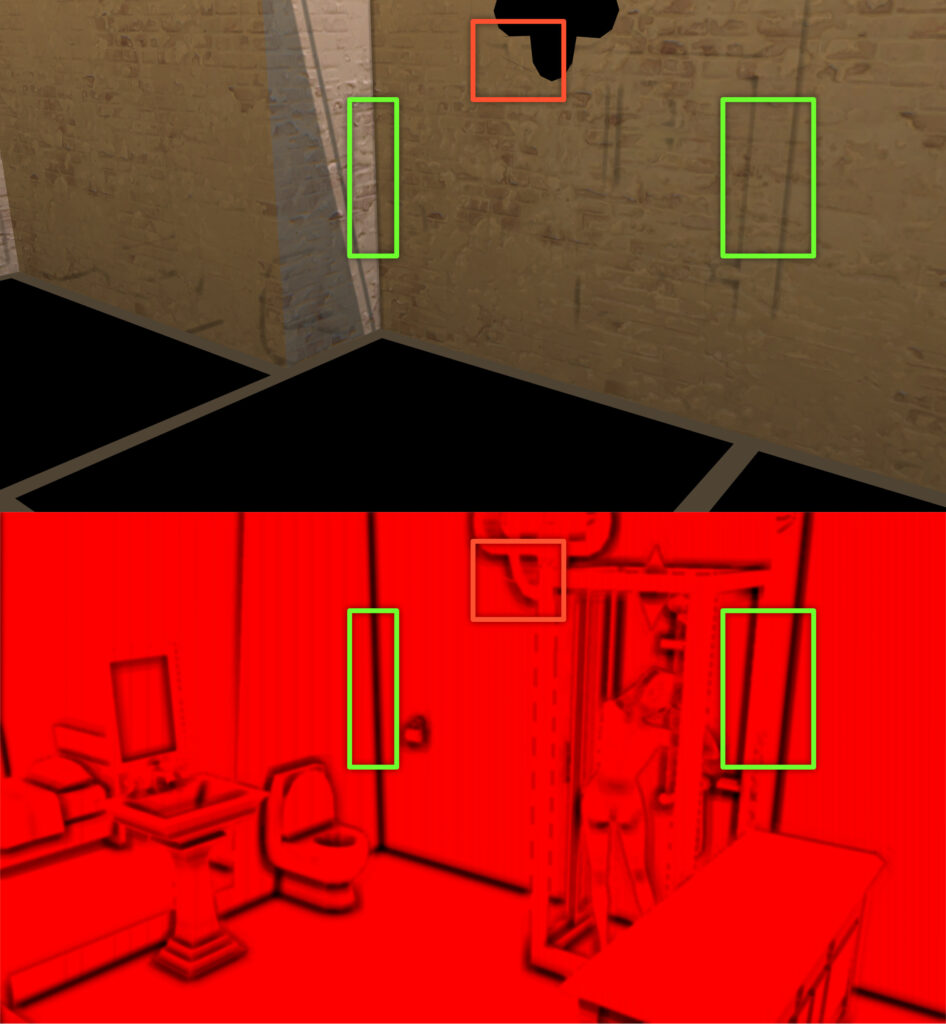
There is something unclear to me, though. The game renders the whole scene into a depth buffer first and then generates an SSAO buffer from that data (see below). When the wall is rendered, we do actual see some of that AO being applied (green boxes) but we also see areas where the AO is not applied (red boxes). I don’t know why that is:

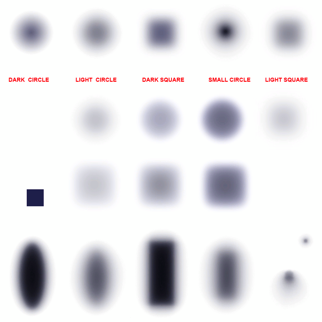
By the way: This is the AO texture for the manual setup. I did not put the red font in there. It’s like this in the original texture! :)


I cannot stress the absurdity of this enough…
Sean Barret explains it best: http://nothings.org/gamedev/ssao/
AO = a abstraction, SSAO = a crude approximation of a abstraction
Can’t say “thx” enough for posting this link. I thought about this corner thing a lot of times and i’ll enjoy reading the article. I love this comment section :,)
Actually that outline was a bug in Unreal Engine 1’s lightmapper (my own lightmapper had the same issue), most likely because it considered anything “outside” the polygon as black and later when it blurred the lightmap to avoid the hard edges of shadows, this blackness was spread to the visible parts of the lightmap. Or at least that was what happened with my lightmapper, but Unreal 1’s seems to have the same behavior (you can’t get rid of those borders without hacks).
~badsector
Hm…interesting thought! Darn, i would love to have contact to the guys if Ex Ion Storm and ask them :)